Learning analytics, a course strong on data science, was my first stop in my graduate degree in information technology and design. The journey was a mix of learning and difficulty, with an emphasis on using data to better understand and improve learning. Here I will take you on a journey through my time spent learning Tableau, a powerful but not-so-user-friendly data visualization tool.
Learning analytics—the study of how to measure, gather, analyze, and report data on learners and their contexts—became the beacon that illuminated this data science journey. The objective was to improve educational experiences using a data-driven approach by discovering the secrets of learning environments and processes.
The course developed as a rigorous investigation into the measurement, gathering, analysis, and reporting of data for the improvement of learning environments, guided by an instructor who was herself well involved in the data science community. The course material was heavy on data science ideas, but it was the practical exercises that made me realize how little I had learned.
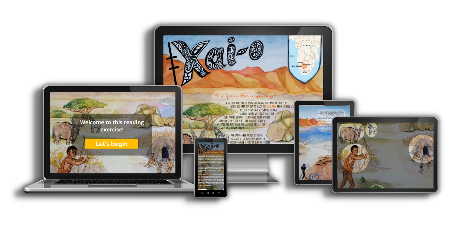
During this investigation, we dove headfirst into the intriguing field of learning analytics as it pertains to natural language processing (NLP). New possibilities emerged when the idea of employing computers to study language emerged. Nevertheless, it became clear that the main emphasis was on studying English. I started to wonder about the wider use of these methods when I became interested in the fight for inclusion in language analysis inside the learning analytics ecosystem.
One of the most prominent figures in the class was Tableau, a powerful program for visualizing data. As I struggled to understand how it worked, though, its intricacy became clear. It became clear that practical experience is the key to unlocking Tableau’s full potential. How well the user knows and uses all of the tool’s capabilities determines how effective the tool is.
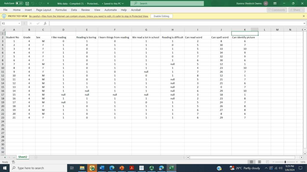
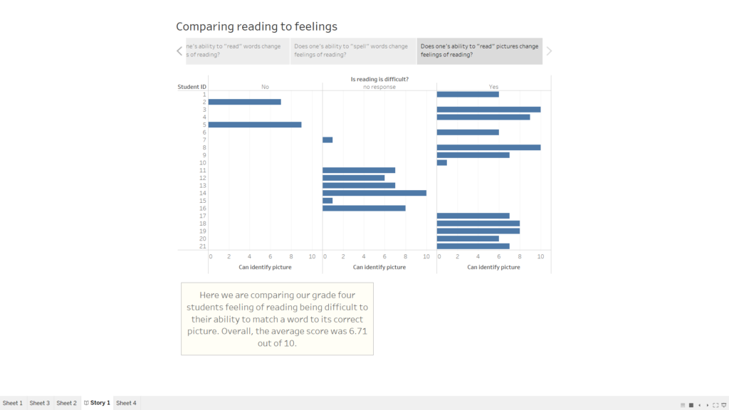
An obstacle that had been plaguing me for a while—the raw data from Selowe—took an unexpected turn in my path. Then along came Dr. Ridenour, the guiding light who illuminated the complexities of data organization and analysis for me. I had to really dig into data organization and assessment value assignment for Selowe’s data because, unlike most of my coursework, which mostly entailed evaluating pre-prepared datasets, this data had its own unique learning curve.
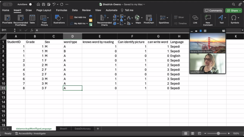
With the raw data in hand, Excel became my weapon of choice. Data structure, methodical organization, and attribute valuation were all greatly aided by Dr. Ridenour’s recommendations. The third sheet contained the precise explanations and definitions of variables, while the second sheet served as a blank slate for the complex numerical details. Unbeknownst to me, this painstaking setup was the secret to unleashing Tableau’s power.
However, there were several hiccups throughout the switch to Tableau. A disorganized display was the outcome of importing the carefully arranged data, thus it was necessary to go back and fix the mistakes. The unpredictability of data visualization tools became a metaphor for Tableau’s tendency to “vomit” files, as I playfully called it.
To make matters more complicated, I had a hard time understanding how to combine many datasets by connecting items that were similar to them. Finding these similarities was like solving a puzzle, and then there was the extra complexity of connecting them. Another theoretical vs. practical hurdle to overcome was choosing the right visualization. Despite going through the tutorials, I learned the hard way that it’s not enough to just pick a chart; you also need to know the story that each dataset tells.
Looking back on this data-heavy course, I see that Tableau is both an ally and a severe obstacle, with a steep learning curve. My practical experience with Selowe’s data set has shown me the value of trial and error in learning Tableau and has educated me on the intricacies of data organization. Overcoming obstacles in the learning analytics landscape with tools like Tableau is a demonstration of the adaptation and resilience needed in the ever-changing data science industry, as well as a technological achievement.